10,000 search results
(0.012 seconds)
- Hair Line - 100% free

- Aire by Lián Types,
$37.00 Aire is what Sproviero would call a < big display family >. We recommend seeing its user’s guide. After his success with Reina, Sproviero comes out with this big family of 7 members: Each of them loaded with lots of sophisticated ligatures, alternates and the entire cyrillic alphabet. The overall impression that the font gives is lightness and delicateness; that’s the reason the designer chose to call it Aire, or Air, in English. "Aire was somehow having a rest from my fat face Reina [...] It started as a really thin style of Reina, but it rapidly migrated from it and grew up alone. And how it grew..." The inspiration came from his own past creations: “The heavy strokes of Reina were shouting for a more delicate thing. Something more feminine. More fragile. Something which had a lot of elegance and fresh air inside”. Aire responds to this: Sproviero found that many of the typefaces of nowadays which are used for headlines (best known as display fonts) have almost always just one, maybe two weight styles. This was his opportunity to try something new. Aire makes it easier for the user to generate different levels/layers of communication thanks to its variety of styles. With this font you can solve entire decorative pieces of design with just one font, and that was the aim of it. Aire was designed to be playful yet formal: While none of its alternates are activated it can be useful for short to medium length texts; and when the user chooses to make use of its open-type decorative glyphs, it can be useful for headlines with dazzling results. On March of 2012, Aire was chosen to be part of the most important exhibition of typography in Latinoamerica: Tipos Latinos 2012. TECHNICAL Aire is a family with many members. In total, the user can choose between almost 6,000 (!) glyphs (1,000 per style). Each member has variants inside, which are open-type programmed: The user decides which glyph to alternate, equalizing the amount of decoration wanted. Every decorative glyph has its weight adjusted to the style it belongs to. Exclusively for decoration, Aire Fleurons Pro is an open-type programmed set of ornaments. And last but not least, remember Aire is delicate. What’s my point? It is not recommended to activate all the alternates at the same time. It is typo-scientifically proved: A maximum of 3 or 4 alternates per word would be more than enough.
 - Air by NiceType,
$35.00 Air is a clean, contemporary, geometric sans typeface that has been designed for use in minimalist layouts where type is hero, such as those for high fashion magazines, and luxury brands. The rounded face is smooth, subtle, and non-intrusive, even when scaled up so will work effortlessly in editorial layouts when used with or without imagery.
 - Air Conditioner - Personal use only

- Air Force - Unknown license

- T-Air - Unknown license

- Street Air by Sipanji21,
$10.00 Street Air is a unique display font with a graffiti-like appearance, with three style font, Regular, outline, and Shadow style. Use this font for any crafting project, apparel design, logotype, advertising, wall decoration, and pretty much anything that requires a personalized look. Take your designs to the next level with this stunning font!
 - Air Leving by Jehansyah,
$9.00 Air Leving this is an elegant font This is an elegant font, with alternatives that you can use as needed, this font is also very suitable to be used as a logo or product icon, it adds to your creative experience and will look much different from the others, suitable for all types of elegant and minimalist themed designs. Include : numeric alternate Latin Thank you very much
 - Winter Airs by Maulana Creative,
$13.00 Winter Airs is a natural feel script font. With rough stroke, fun character with a bit of ligatures and has a two files lowercase alternates. To give you an extra creative work. Winter Airs font support multilingual more than 100+ language. This font is good for logo design, Social media, Movie Titles, Books Titles, a short text even a long text letter and good for your secondary text font with sans or serif. Make a stunning work with Winter Airs font. Cheers, MaulanaCreative
 - Air Time by Epiclinez,
$18.00 Air Time is a fun and playful display font. Its unique handwritten style makes it fitting to a wide range of designs. So add it confidently to your informal or casual ideas, and you will love the results. The font Air Time contains 204 glyphs. Supporting more than 66 languages, from English to Zulu. This cute font also contains OpenType features such as ligatures with alternates or substitutes.
 - Air Force by Indian Summer Studio,
$25.00 The family for the official US military fonts/lettering used in U.S. Air Force, U.S. Army, U.S. Navy, U.S. Marine Corps. Made after the existing Military Standards and Technical Manuals.
 - Air Crash by Jehansyah,
$12.00 Air Crush is a modified font of the previous design, I tried to give it a touch of brush, because it will look very strong and bold, and after finishing this boomb the result, looks very energized and very exotic, very suitable for all kinds of designs, titles, books, movies, t-shirts, and much more
 - Southern Aire by Mans Greback,
$59.00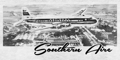
- Air Factory by Khaito Gengo,
$22.00 Air Factory was originally designed for a merchandise company, and ordered to design iconic but plain forms. Air Factory is a very simple and modern sans-serif font inspired by early 1900’s typefaces, like Futura, and consisting of 5 weights and stencil type(free). This contemporary typeface would be good used for restaurant, retail, book, poster etc. Air Factory also features various ligatures, stylistic alternates, fractions, and languages as well.
 - Air Superfamily by Positype,
$29.00 In B-movie awesomeness, Air began as Grotesk vs. Grotesque. I was trying to unify the prevailing traits of German and English Grotes(que/k)s in order to make something different but familiar. I am NOT trying to reinvent Helvetica (snore), so get that out of your system. From the onset, I intended this typeface to be a true workhorse that offers infinite options and flexibility for the user. At its core, it is the maturation of the Aaux Next skeleton I developed years ago. I worked out Aaux Next to settle my issues and love for Akzidenz. With Aaux Next, I strove to be mechanical, cold and unforgiving with it. I was single, young, cocky and it fit. Now I'm married, kids, dog and have found that I've turned into a big softy. When I look at Aaux Next (and have for the past few years) I see another typeface trying to eek out. I wanted it to avoid the trappings of robotic sans, quick tricks and compromises. The typeface’s DNA needed to be drawn and not just generated on a screen — so I set aside a year. I love type. I love working with type. I hate when my options for a slanted complement is only oblique or italic. I set out to produce both to balance usage — there are more than enough reasons to prepare both and I want the user to feel free to consciously choose (and have the option to choose) the appropriate typeface for print, web, etc. That flexibility was central to my decision-making process. The Oblique is immediate and aggressive. The Italic was redrawn at a less severe angle with far more movement and, as a result, is far more congenial when paired with the Uprights. Condensed and Compressed. Yep, why not? I know I would use them. There are nine weights currently available. The logical progression of weights and the intended flexibility demanded I explore a number of light weights and their potential uses — this has produced a number of ‘light without being too light’ options that really work based on the size. The result is a robust 81-font superfamily that is functional, professional, and highly legible without compromising its personality. Pair that with over 900 characters per font that includes ligatures, discretionary ligatures, stylistic alternates, fractions, proportional/tabular lining and proportional/tabular oldstyle figures, numerators, denominators, ordinals, superiors, inferiors, small caps, case-sensitive functionality and extensive language support and you have a versatile superfamily well-suited for any project.
 - Diner - Unknown license

- Linea - Unknown license

- Niner - Unknown license

- Liger by Flawlessandco,
$9.00 Introducing "Liger" - a dynamic and captivating sport display font designed to make a bold statement. Inspired by the power and agility of the legendary creature it's named after, Liger brings a perfect blend of strength and style to your creative projects. There's some connected letters and some alternates that suitable for any graphic designs such as branding materials, t-shirt, print, business cards, logo, poster, t-shirt, photography, quotes .etc This font support for some multilingual. Also contains uppercase A-Z and lowercase a-z, alternate character, numbers 0-9, and some punctuation. If you need help, just write me! Thanks so much for checking out my shop!
 - Linear by URW Type Foundry,
$89.99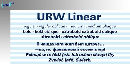
- Linear by Type Associates,
$24.95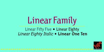
- Lifer by words+pictures,
$20.00A modern serif typeface. - LineDrive by Ingrimayne Type,
$12.95 LineDrive was inspired by an obscure 19th century type design. It has no curved lines and what are normally circular elements in the lower-case letters are diamond-shaped. It might work best with only upper-case letters, which have a Victorian feel to them. In addition to the two weights of plain and bold, the family includes a shadowed version and an inline (or outlined) version.
 - Linea by Page Studio Graphics,
$25.00 - Kiner by Yock Mercado,
$12.00 Kiner is a typeface designed by Jorge Mercado, inspired in old western letters used in many industries. Kiner support most latin languages, and the set includes uppercase and lowercase.
 - Gliners by Dumadi,
$25.00 Gliners is a simple stylized font that overlies the center of the glyphs bar in the font. Glyphs font doesn’t have too many, it only offers Uppercase and Multilingual, but don’t worry because its simple shape will make your project look interesting. The Gliners font is very suitable for use as movie titles, movie title poster covers like the review image I shared above. how? are you interested in trying it? Thank You, stay the center of attention and classy!
 - Mineral by bb-bureau,
$60.00 Glittering writing, fractured into multiple tetragonal splinters, rectangular modules slightly spaced, like quartz and pixels. A Kapla style construction, with stencil properties (except Border and Outline version ) designed by Benoît Bodhuin . Mineral Solid has 4 stylistic titling alternatives (Border, Outline, Blunt and Smooth).
 - Literal by Kosinsky,
$25.00 Literal is a classic sans serif typeface with closed shapes. Simple and elegant at the same time, it is perfect for a wide range of uses, where you need both large and small text, be it a print product, website design, logo design and much more. The font supports Extended Latin and Extended Cyrillic. Created in 2019. Type designer Igor Kosinsky.
 - Lineare by Tipo,
$35.00 Lineare Serif is an attempt at solving the difficult problem of creating readable text type, seeking new ways to provide readers with some pleasure and rest as they walk along each line, creating a space where there is harmony between man and the printed form. Asymmetric serifs both in their height and width, medium contrast in the stroke, and balanced upward and downward movements make “Lineare Serif” a typeface featuring both attitude and aptitude for editorial purposes.
 - ideoma LINER - Personal use only

- Koscar Liners by madeDeduk,
$14.00 Introducing Koscar Liners is a realistic handwritten font and will be perfect for book, title branding, product packaging, invitation, quotes, label, poster, logo etc. Feature Uppercase & Lowercase Number & Symbol International Glyphs Multilingual support Alternative Ligature Thanks so much for checking out my shop and feel free to drop us a message any time and follow my shop for upcoming updates Hope you enjoy it.
 - Perfecta Liner by Invasi Studio,
$17.00 Perfecta Liner is a handwritten organic font that is perfect for branding, signatures, wedding invitations, promotions, product packaging, and more. Perfecta Liner is a modern, clean, authentic font. Perfecta Liner comes with ligatures, alternates, and supports 60+ Latin-based languages. Features: Total 261 Glyph Uppercase & Lowercase Numerals & Punctuation Alternates and Ligatures Multilanguage Supports 60+ Latin based languages
 - Liner Notes by AdultHumanMale,
$20.00 Liner Notes is a fun scrawly, marker felt, ALL CAPS display font. I wanted it to look fun, loud, and to have hints of School graffiti, so it can wail from Posters and Headlines. It has over 260 glyphs and several variations on the standard alphabet and all those extra pésk¥ foreign features. It also has various letters with extra ligatures and flourishes available through OpenType or your Glyphs palette. OMG, LOL I also added some web slang to the glyphs.
 - Lined by Oscar Pastarus,
$18.00The Lined font started out with some scribbles - playing with lines and making shapes fold, underlap and overlap, eventually evolving into letters. This is a display/ornamental font and it was made in 2009, it's meant for decorative use and not in large bodies of text. For example it does well used as a headline font. It is proportionally spaced and uppercase only. - Eire - Unknown license

- Airo by LetterMaker,
$28.90 Airo is a monospace type family with inverted contrast. The distinct shapes and detailing give Airo a strong typographic voice. The family comes in six carefully selected weights, from Light to Extra Bold, making it a versatile typographic tool. The family works best as a display typeface for creating a strong visual impact, but you can use the lighter weights for medium length text as well.
 - Aira by Jafar07,
$19.00 Aira is a serif font with a modern style that is designed very neatly and boldly, especially for designers and clients who want to have a classic yet trendy design concept, with 35 alternative lowercase letters and 9 ligatures, as an option for those of you who want to add a unique touch to your design. This font is perfect for a sturdy and discreet company logo and is also perfect for magazine layout designs, articles, quotes, and even posters.
 - Airy by ParaType,
$25.00Airy is in fact a very light-minded summer font without any serious design concept. It is a collection of hand-drawn letters that with the help of OpenType features allow you to get a lace texture with mutable structure. Together with the font you also get a bonus — a set of naive pictures that you normally draw on the margins of your sketchbook. - Airwings by Parker Creative,
$18.00 Airwings is a retro narrow typeface that includes Regular, Distressed, and Outline versions. Each version can be used on its own or combined and overlaid to create even more design options. Airwings is a versatile typeface that can be used in many ways for many different types of designs from album covers, to movie posters, clothing lines, restaurants, and more. Combine Regular and Outline versions to create a retro 3-D look. Use the Distressed version to add a grungy feel to your design.
 - Apres by Font Bureau,
$40.00 David Berlow and staff drew Apres as part of a series designed originally for the Palm Pre smart phone, for use both on the device and in print marketing. Simple, open letterforms and generous proportions provide a clear, comfortable, and inviting experience for navigation and readability. The plain-spoken geometry is regular and balanced, without being static or mechanical, for a friendly and forthright familiarity; FB 2008


Page 1 of 250Next page